
He #COVID19 It is a terrifying virus and there are many doubts that assail us every day… But what if we had a COVID-19 dashboard in Spain that updates its information daily with all the information you need to know about the virus in #Spain divided by communities?
This is what we present to you today, a dashboard that will certainly not leave anyone indifferent, developed together with my colleague and friend from the degree in Data Science of the Polytechnic University of Valencia (UPV) #UPV
Summary:
The COVID-19 Dashboard in Spain contains a series of data on COVID-19 of vital importance such as the number of cases or, the number of deaths. These indicators are essential to determine the status of the virus in Spain.
Data:
Also, The data are presented in absolute and relative magnitudes depending on the population, so we can know what the degree of incidence is. These data are grouped by Autonomous Community so that we can know the state of our Autonomous Community.
Graphics
By last, the data is represented in different formats (maps, bar graphs) interactive so the user can play with these and select / modify the graphic to their liking.
Enlace al dashboard:
https://entredatos.es/dashboard/covid-19-spain/
Video explicativo:
A series of steps have been followed for the development of the COVID-19 dashboard in Spain. Specific, have been developed following the 7 display phases.
Detailed explanation of the COVID-19 dashboard in Spain (for geeks)
1. Introduction
Data visualization is a very powerful tool that allows you to observe reality objectively and thus be able to draw conclusions or useful knowledge quickly and easily.
It is important to know that in every visualization process one or more questions are answered and that based on these, the necessary visualizations must be made to allow them to be answered easily.
2. Initial question
In this case, you want to know what is the status and evolution of COVID-19 in Spain. Specifically, they wanted to know how many people have suffered from COVID-19, how many have died and also what is the lethality of this virus. Too, It is interesting to know what has been the evolution and status of the virus by Community / Autonomous City. For all this, the question that arises is the following:
– What is the status of COVID-19 in Spain today and how has this evolved over time both at the national level and by autonomous community?
Once you know the question you want to answer, you can begin to describe the 7 display phases.
3. The 7 display phases
Then, Each one of the visualization phases that has been passed when carrying out this project will be described.
3.1 Acquisition
The first phase consists of obtaining the data, in this case, Data is sought that collects cases and deaths from COVID-19 in Spain separated by community / Autonomous City. Also, the aim is that the data is updated daily in order to make real-time visualizations.
This data has been found in the official Github repository of the Science and Engineering Systems team at Johns Hopkins University
Too, Geographic information is required for each of the autonomous communities / cities of Spain, to later make a heat map (Choropleth) with COVID-19 data. We have found this data in a Github repository of the organization 'Code for America’
By last, in order to make new metrics that are useful to know the status of COVID-19 and its evolution in the different autonomous communities / cities, Census data are required from the population census of these regions. Thus, you can find out what percentage of the population has been affected by COVID-19. These data have been found on the INE page (National statistical institute of Spain)
3.2 Formatted
In this section, the names of the columns of the COVID-19 data have been changed, translating them into Spanish.
Too, the census of the Spanish population has been formatted, since the population was expressed in a text string separated by points every three numbers. Has been passed to an integer.
3.3 Filtered out
In this part the data of less interest have been eliminated. In the case of the COVID-19 data, all observations that did not belong to Spain have been eliminated, too, Columns such as recovered cases and active cases have been removed as they were mere estimates and were not of interest to us.
In the geographical data of Spain, rendering detail has been reduced to optimize display (reduce loading time) through a very useful free distribution tool called ‘mapshaper’ that can be found in the following link: https://mapshaper.org/
This tool allows to apply simplification algorithms that reduce the size of the data file by eliminating observations and simplifying the polygons that make up each of the regions. Thus, a much smaller file is obtained and for practical purposes this simplification is barely perceptible to the naked eye.
Regarding the data from the Spanish census, the column corresponding to the sex of the population has been eliminated, since in this case only the total number of men and women is interesting.
3.4 Mined
Mining seeks to discern patterns or place the data in a mathematical context. In this case, the mining that has been carried out is basic.
First of all, COVID-19 data sources and the census have been brought together.
Second, they have formed 3 new measures or columns for each of the autonomous communities, these are:
– % lethality: Indicates the percentage on 100 people dying from COVID-19.
Your calculation would be the following: (Deaths / Confirmed cases) * 100
– % Total infected population: Indicates the percentage on 100 of the population that has suffered from COVID-19.
Your calculation would be the following: (Confirmed cases / Population) * 100
– % Total deceased population: Indicates the percentage on 100 of the population that has died from COVID-19:
Your calculation would be the following: (Deaths / Population) * 100
Regarding geographic data, the position of the Canary Islands made that when represented on a map, you are very far from Spain. Thus, it has been decided to move the original coordinates of the Canary Islands so that they are closer to the peninsula (as in the weather maps of the news). This has been achieved by creating a recursive function that runs through each of the coordinates of the Canary Islands and adds a constant to latitude and another constant other than longitude.
Too, The size of the autonomous cities of Ceuta and Melilla has been modified, making them much larger so that they can be identified with the naked eye on the map, as its original size was too small to be identified.
3.5 Representation
In the representation, the different types of graphs are chosen to be able to visualize the data and therefore answer the question. In this case, Quite simple forms have been chosen since they are the easiest to understand and transmit information to the user. Color maps have been chosen (Choropleth), bar charts and line charts. Also, use has been made of callouts that indicate the KPI (key performance indicators), which in this case are metrics that indicate the status of COVID-19 in Spain.
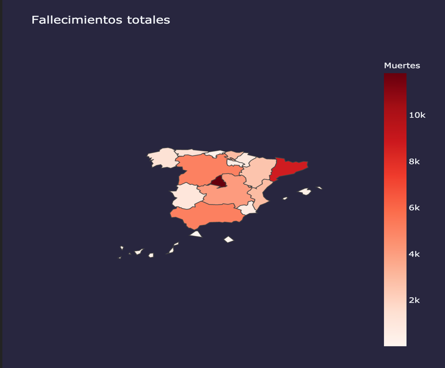
Graphic 1: Heat map of cumulative number of deaths
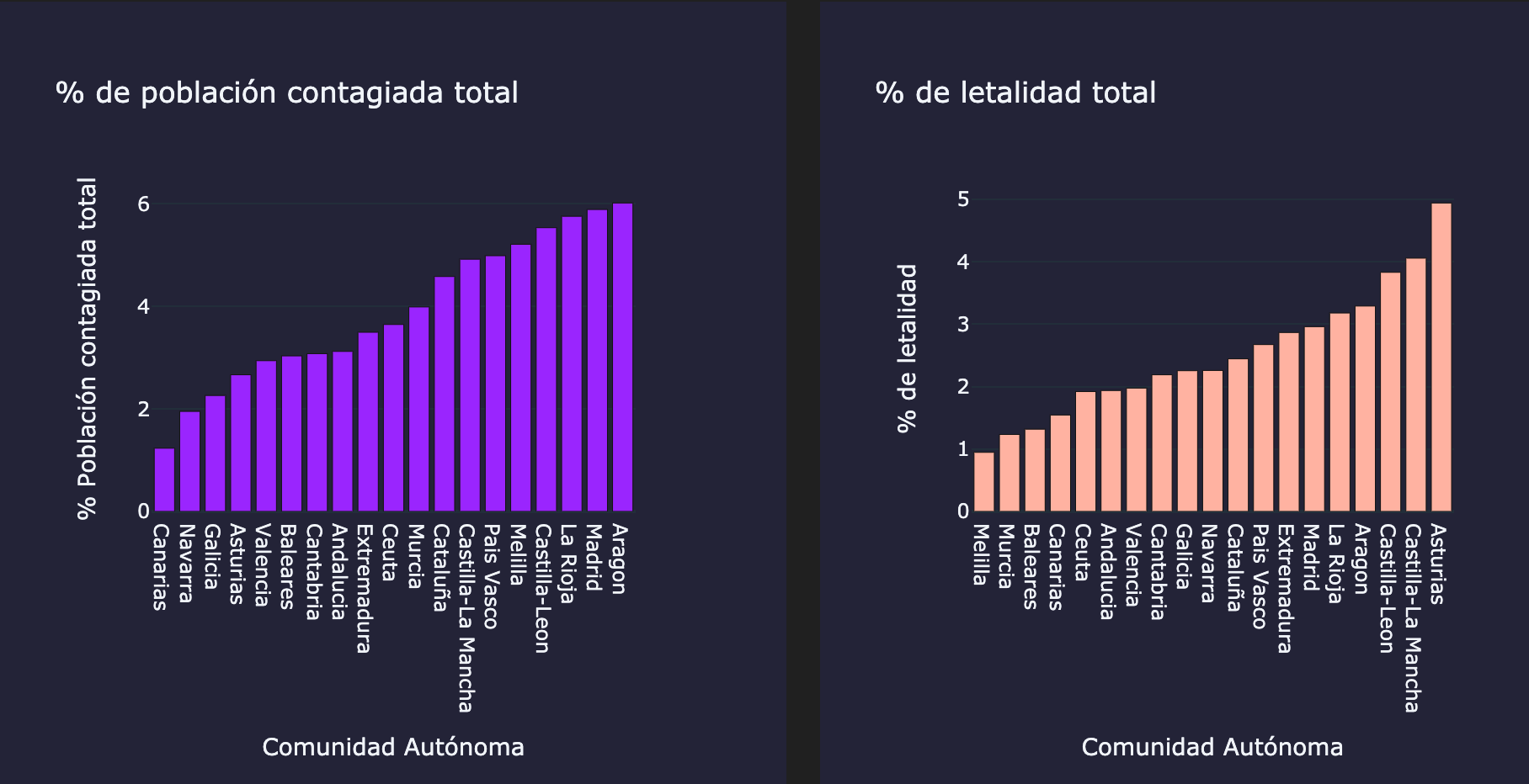
Graphic 2: Accumulated bars of % of infected population and % fatality rate by autonomous community
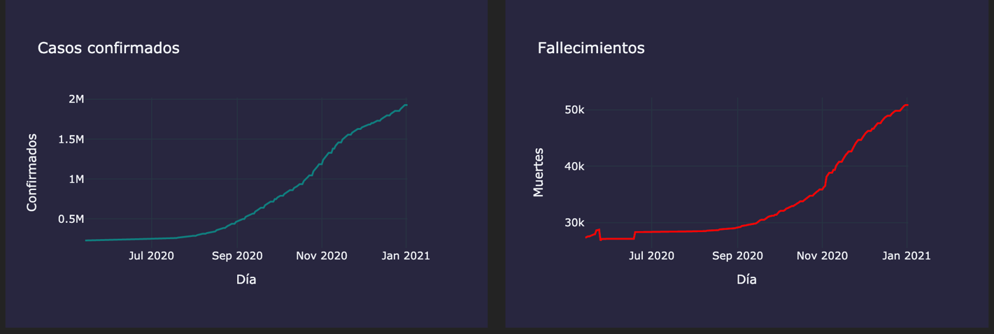
Graphic 3: Cumulative evolution of cases and deaths from COVID-19 in Spain

Graphic 4: Use of callouts that indicate the status of COVID-19 in Spain
3.6 Refined
In refining, the aim is to improve the representation and make it more attractive to the human eye. The graphics presented above have already been refined. The process that has been followed has been:
1º. Create a color palette for each of the indicators:
– Deaths: Red
– Confirmed cases: Turquoise green
– % Infected population: Lavender
– % Population lethality: Salmon
– % Deceased population: pink stick
2º. Create a color and typography palette for graphics and lettering:
Background color: Dark blue
Font color: White
Typography: Open Sans
The indicator color palette has been defined to improve the representation so that the user can associate a color with a type of indicator, thus, it is easier for the user to identify each of the indiciators.
The color and typography palette for the graphics and letters has been chosen so that the visualizations are more attractive to the human eye..
3.7 Interaction
The interaction allows the user to get involved in the graph either to interactively select relevant information or even to generate new graphs to suit the user..
In this dashboard, interaction is essential due to the high number of autonomous communities. Instead of making a graph per community, It is preferred that the user chooses the community in which he is interested and thus can see the evolution of the chosen community without overloading the dashboard with many other communities that are not of interest.
On the chloropathic map and bar graphs, the user can see the detailed information by community just by hovering the mouse over it. Also, on the color map, the user can choose what to represent on the map through a series of windows (deaths, Confirmed cases, percentages ...)
On the charts showing the evolution (time series), the user can choose between the different autonomous communities making use of the autonomous community selector.
4. conclusion
The visualization of data is a tool that is increasingly present in our society since it allows obtaining information and, through this, draw useful insights and insights quickly and efficiently.
In this case, It was intended to reflect the status of COVID-19 and its evolution in the different autonomous communities / cities of Spain. For this task, A dashboard has been made that gathers the visualizations of different indicators of interest to know the status and evolution of COVID-19. This can be consulted in the following link: