
Project carried out by:
- Álvaro Mazcuñán Herreros (https://www.linkedin.com/in/alvaro-mazcu-herreros/).
- Miquel Marín Colomé (https://www.linkedin.com/in/miquel-marin-colome/).
Dashboard code: https://github.com/alvaro-mazcu-herreros/terrorism
Brief explanation of the project: https://www.youtube.com/watch?v=IkTyzmrT-1w&feature=youtu.be
INTRODUCTION
Year after year wars happen, conflicts and revolts taking dozens of lives ahead, destroying cities, regions and countries. They also leave a large herd of wounded, saturating hospitals and medical centers in conflictive areas.
When an attack happens and it is told on television, the viewer may come up with questions such as: “Where are the terrorist attacks most concentrated?”, "Which countries are the most affected?”, What types of attack are the most popular?”. These questions do not have an instant answer, but thanks to this project it is possible to solve these questions.
VISUALIZATION PHASES
Once the objective of this work has been entered, you can move on to the important part of it, the description of each of the visualization phases.
ACQUISITION
The chosen database is from the well-known website Kaggle (https://www.kaggle.com/START-UMD/gtd) . Said base, stores information on terrorist attacks since the year 1970 until the 2017. Obtaining these data was simple. It was downloaded in csv format. Along with the database, A PDF was also obtained that explained what type of information each variable stored (metadata).
FILTERED OUT
Given the large volume of data that the table stores “terrorism”, It was necessary to reduce that weight in order to speed up the calculations necessary for the following phases. Thus, all data except those of interest were deleted.
This phase was carried out in Python, as it is a powerful tool for filtering and data formatting tasks. Before making any modifications, the database had 135 columns for 176330 attacks. It was completely necessary to reduce the dimensions of this.
Thus, only the variables that would be useful for future analyzes were selected. These variables in question are:
“iyear”: stores the year of the attack. Take values from 1970 until 2017.
“imonth”: stores the month of the attack.
“iday”: save the day of the attack.
“crit1”, ”crit2”, “crit3”: they store the information about why the attack was carried out.
“country_txt”: in which country the attack occurred.
“region_txt”: region where the attack happened.
“provstate”: province / state where the attack occurred.
“city”: attack city.
“latitude" Y "longitude”: exact geographic point where the attack happened.
“attacktype1”: type of attack. Categorical quantitative variable that indicates the types of terrorist attack such as bombing, murder, rapture…
“suicide”: Categorical quantitative variable that says if the attack was suicidal or not.
“weaptype1”: Categorical quantitative variable that reports the type of weapon used in the attack.
“nkill" Y "nwound”: number of dead and wounded in one attack, respectively.
“success”: Categorical quantitative variable. Was the attack successful or not?
“propextend”: Categorical quantitative variable that reports the economic impact of the attack. Stores if the attack caused damage less than $ 1M, less than 1 trillion dollars or more than this amount.
Some of these variables were used solely for exploratory purposes and did not enter into el dashboard final. It is the case of “crit1”, ”crit2”, “crit3”, “region_txt" Y "success”, among other.
FORMATTING
Many of these variables came in the wrong format. All those that were quantitative categorical took values float, having the decimal character without providing any information. Thus, were transformed to character string. Also, some strings like the year, month and day were integers and needed to change the type. So, all variables become string, except "nkill" Y "nwoundWhich are integers.
By having many observations, it is normal to find missing data. A test was made to remove all these values, but the database went from 170000 attacks just 40000. How much information was lost, these missing values were left. As an exception, in the two numerical variables mentioned above, instead of leaving these missing values, these gaps were imputed by the mean of each column.
All these modifications are included in the file "Clean_And_Recoding.ipynb", where the process of formatting these variables is explained step by step.
Also, to represent the countries in one of the graphs, this required that the territories of the world had an exact code to be able to paint them on the map in question. Because of this, a change in the name of the same was needed. To make this modification, he got hold of the bookstore countrycode which transformed the name of the country to the corresponding code. For example, it went from "Spain" to "ESP".
MINED
The project now goes to R. In this language the code was prepared to make each graph. Numerous recodes were implemented, filters and obtaining statistics for the correct implementation of graphic elements. For example, for the creation of many of the graphs certain specific information was needed for a country in a specific period of time. For it, the use of sums has been key to achieve the data that was required.
In the beginning, everything was in the same document but the execution time exceeded 3 minutes each time you wanted to get the dashboard final. Because of this, all data mining calculations were separated from the code in Rmarkdown and it was executed once in another document thus saving in a csv the output of the algorithms created to simplify the information of this step. By saving these tables in a separate file, it was possible to reduce the execution time of 3 minutes just 10 seconds. So nothing data mining will appear in the final code, but this information display layer has been taken into account.
As observation, it is clearly seen that, in the last tab of the dashboard, the mining layer has been implemented, since sums are made of both the number of deaths and injuries in the selected country.
REPRESENTATION
Before carrying out the dashboard in question, Each of the graphs contained in this has been executed separately. The first of them, and the most important, is the visualization of a world map in which some points are graphed on top of it. These points deal with each and every one of the terrorist attacks that occurred between the year 1970 and the 2017.
It is thought that by making this graph, a very general visualization of the subject being discussed can be obtained from the beginning, thus, when viewing the rest of the graphic elements of the dashboard, the nature of the data used will be fully known.
At first they wanted to paint these points in red. However, in the next phase (Refined) the reasons why it has finally changed to a yellow color will be explained.
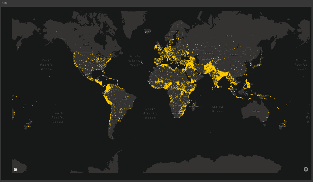
Illustration – Terrorist attacks map
Then, once an overview of the attacks has been obtained using the world map, now move on to the realization of another map, in this case a Choropleth, in which countries are shaded in different colors, often of the same color range. By means of this graphic representation it is intended to show the number of total deaths by country.
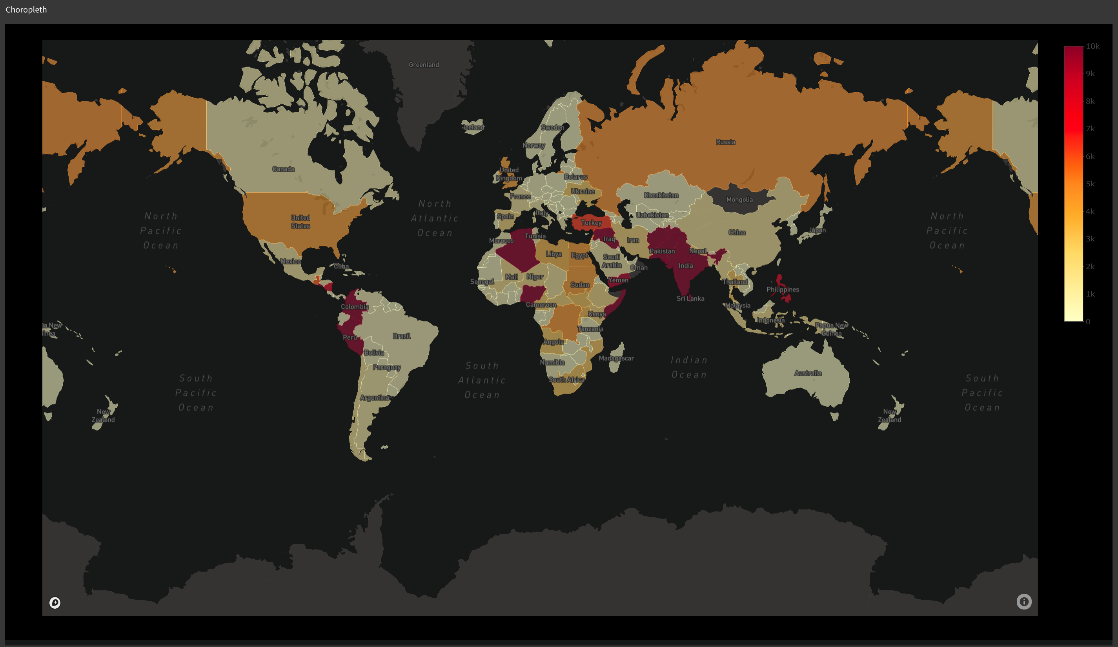
Illustration – Choropleth terrorist attacks
The sequence of colors that has been chosen to represent this information is the “YlOrRd” containing from very light yellow to dark red. This palette has been chosen since data about terrorism is being processed and it is convenient to use “warm” colors to represent said information.
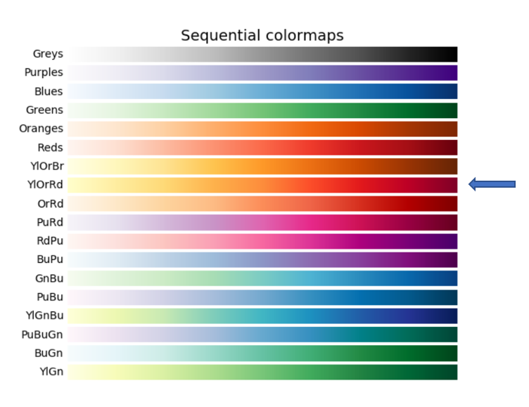
Illustration – Color sequence (paddles)
Now more detailed information will be displayed. to get started, the same map as in the beginning is implemented again but with a nuance that will be explained in the interaction phase. Next to this map, two more graphics appear.
The first one is a bar graph that contains information on the most popular attacks that occurred between the years that are available in the database.. To represent said information, the variable “attacktype1”. In each of the bars, the count of attacks made of that type is displayed. Later, In the Refining and Interaction sections, each of the improvements that have been made in this representation will be explained.
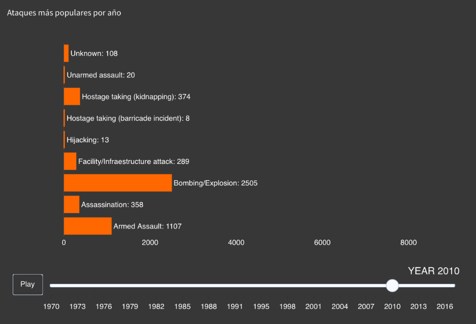
Illustration – Popular attacks bar chart
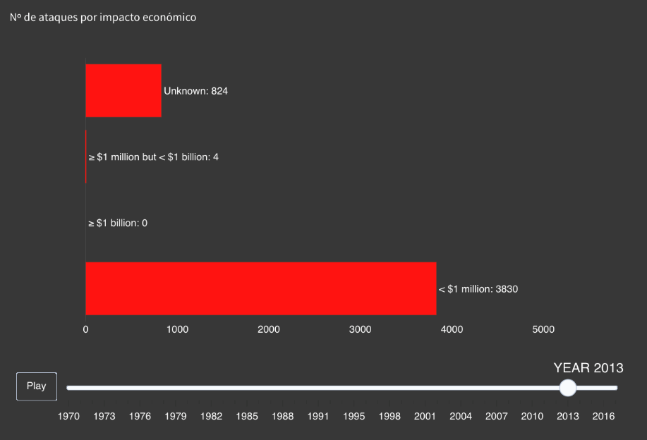 Then, along with the graphic just presented, another bar chart is attached. In this case, the variable “propextend”. Said variable, as explained in the section on the Filtering phase, explains the economic impact of that particular attack. Similar to the previous graph, The number of attacks has been counted for each of the economic impacts that have caused.
Illustration – Bar chart economic impact terrorist attacks
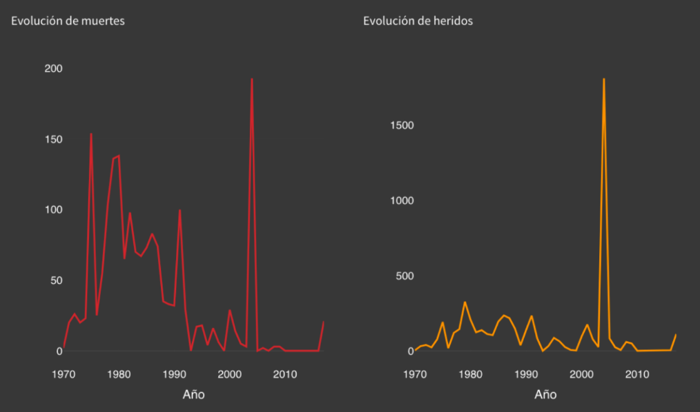
Finally, in the last tab of the dashboard, even more detailed information is described, in this case, the data is shown for a specific country. On one side, the map is presented with the attacks painted on the top and, on the bottom, Three types of graphs are made to represent both deaths and injuries from terrorist attacks.
- The first of these is a graphic element known as ValueBox what, as the name indicates, it is a box that indicates a specific value. For this case, Two of these graphs will be used to show the number of deaths and the number of total injuries for a specific country.
- The second type is a line graph that indicates the evolution of the deceased / injured in that specific country. For this, the sum of these variables has been obtained for each year.
 And the third is another bar chart that is related to the one previously discussed. However, in this case, instead of counting the number of attacks made of each type, the sum of deaths / injuries caused by each of these is obtained for each year.
 And the third is another bar chart that is related to the one previously discussed. However, in this case, instead of counting the number of attacks made of each type, the sum of deaths / injuries caused by each of these is obtained for each year.
Illustration – Line chart of deaths and injuries in Spain
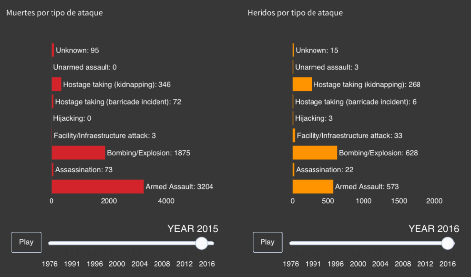
Illustration – Bar chart killed and injured by type of attack in Nigeria
INTERACTION
To make the graphs much more dynamic and that the user could investigate and observe the information he wanted, numerous buttons and selectors were implemented.
Firstly, in the tab in which information is treated in more detail, This subsection consists of displaying the information according to the type of attack. To the left of the graphics, a drop-down appears to select the type of attack. By selecting, for example, “Murder”, the map will now show the attacks that have been murders. In this same tab, A button is implemented in the two graphs below to initialize the interaction over the years and to visualize this information in a much more fun way.
In the case of the last tab, the procedure is very similar but varies in the selector, that now it will be by country and not by type of attack. Also, this change affects all the graphic elements present in that tab. The button has the same use as in the previous explanation.
It is appropriate to comment that the selector used is not the one that offers Plotly, if not, it is the one offered by the bookstore Shiny. To be able to use it, the function is used selectInput to select and, later, the code of Plotly under the function renderPlotly. For the selected value to affect the graph, the element in question will be invoked with input$Tipo (being Kind the name given to the coach).
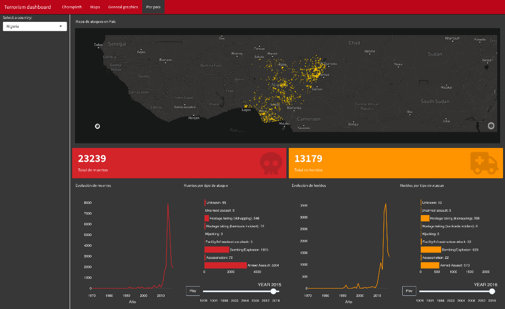
Illustration – Complete dashboard information by Country
REFINED
Finally, once each and every graph has been obtained and the interaction between them has been added, the last visualization phase would now be passed, that of refined, which would consist of improving each of the representations raised from the beginning.
In the representation phase, the first graph entered was the map with the points (in reference to attacks) painted on it. At first they had been colored red but, it ended up changing to a yellow. This decision is given during the completion of the last tab of the dashboard, in which the graphics of deceased and injured are represented along with the map. If the red color was left on the dots, anyone who visualized the dashboard I could associate it with the deceased and not with an attack in general.
Regarding the tones in the tab of the detailed graphics, since the map is displayed in yellow, It was intended to imply that what was represented in the two graphs at the bottom is another type of information different from that of the map but, To some extent, related. Thus, it has been decided to use colors analogous to the yellow of the map for the other graphics, taking orange values.
Finally, I would have to talk about the colors of the graphs of the last tab, referring to the wounded and deceased in each of the attacks. As previously mentioned, the map (found at the top of the tab) will be painted with the dots in yellow. Thus, it has been decided to choose analogous colors that represent very similar information. Therefore, a not very saturated red color is chosen to represent the information of the deceased and a not very dark orange for the injured.
It should be added that in the "ValueBox” mentioned above, two icons are added to further clarify what each of these graphics represents. For the deceased a skull and, for the wounded, an ambulance.
CONCLUSION
In reference to the questions in the introduction, this project brings the user closer to possible answers.
For the question “Where are the terrorist attacks most concentrated?” The answer is clear, naked eye, India and Bangladesh take the jack to the water. Just by looking at the global map of attacks, The area of these countries is hardly appreciated by the amount of attacks they have received.
“What about the most affected countries?” Observing the Choropeth it is appreciated that those that are painted in a darker color are the most affected. Of these, Iraq is the one that has registered the most deaths (the value can be specifically observed by positioning itself on that country → 79565)
And for the question What types of attack are the most popular?” Armed assaults and bombings are the most common, especially in the Middle East and Asia.
Dashboard code: https://github.com/alvaro-mazcu-herreros/terrorism
Brief explanation of the project: https://www.youtube.com/watch?v=IkTyzmrT-1w&feature=youtu.be