

Authors:
- Alvaro Mazcuñán Herreros
- Miquel Marín Colomé
- Lisa Gilyarovskaya
- Ignacio Cano Navarro
- Angel Langdon Villamayor
- Iker Rodriguez
SafeGraph «Patterns» Data Filtering 6
More Data Sources for later Integration 7
Data Transformations and Integration 8
Data Normalization (CBG micro normalization) 9
First glance to real visits 10
Model / Evaluation Iteration 14
Introduction
Costomize is a project that tries to help certain American businesses in the predicted number of clients they are going to have on a specific day, along with predicted income and necessary number of employees to cover the daily workforce. The model will be created from data patterns provided by SafeGraph company.
For that purpose we have chosen four representative American businesses as Subway, Walmart, Starbucks and Old Navy. Due to the fact that we only had 2020 and 2021 data we wanted to choose a place where COVID period was not extremely significant so we could use both years for model training. Our selection was Houston, Texas since the restrictions there were not as strict and prolonged as in other states and data patterns were not barely affected by COVID.
Value Assessment
The information extracted from our predictions can be extremely useful for all kinds of businesses (how much stock a specific shop is going to need, hiring part-time staff at peak days, foreseeing income), especially for food franchises due to the fact that normally client visits in this kind of businesses are equivalent to purchases. This information is going to be useful for businesses because they can foresee the necessary stock as well as staff amount. The criteria for success is going to be the predictive capability of the model, that is, how well the model is going to be able to predict the amount of people that are going to be present in a window of time in a specific place. We will train the model and then we will make predictions and evaluate its accuracy as well as other measures that could interest potential clients.
When putting our model into practice there could be two ways that it could go wrong: It can overestimate the number of visitors or the other way around, that is, underestimate it. If it overestimates the number of visitors, the company would allocate more resources (employees, stock) than necessary and that would lead to losses. On the other hand, if it underestimates the number of visitors, It would translate to larger queues due to the lack of employees and even shortage due to lack of stock. That is why our first advice to our clients would be to take our predictions as an advice and not as an absolute truth, in order to avoid big mistakes that could potentially cause losses due to ‘unusual days’ where by external factors not taken into account by the model there are more or less visitors than expected.
Taking the business point of view into consideration, we are not going to have any problems with legal misuse due to the fact that our webplace will have a personal area for each of our clients with all the personal reports and predictions and a reminder that our analyses are going to be speculative and could not be taken as an absolute truth.
Regarding ethics and environment, we are aware that there could be a certain social bias in our data: the mobility data we have is obtained from Android and Apple devices. Logically, by studying only the data of people with these devices, we are introducing a certain discrimination towards the people who can not afford such devices, as their mobility patterns/habits are not taken into account.
To conclude the Value Assessment we would like to point out that our project currently has two big limitations. The first one is due to the data’s origin, we are using data patterns that come from an app that decides which stores a particular person has visited (more of this in the Data description section). This makes the data not as ‘real’ as we would like it to be and therefore our predictions are going to be significantly worse than if we had direct ‘real’ data from our clients’ visit counts. (We can not check if the data we have is similar to the real visits that a store had on a particular day ). The second limitation is that we have trained our model to predict visits only a day ahead, we know it would be possible to change this and make our model capable of predicting more than one day ahead but it would be a lot of effort in vain, because every company would like different days ahead to be predicted. It is obvious that in a real situation we would adapt to the clients’ needs.
Technical Integration
In terms of technical tools, this team wanted to go one step further than we did last year. That is why we wanted to change from coding and storing scripts locally to an environment where all of us had the same code completely updated at real time with a possibility of work at the same time remotely.
So, we decided to store our code in a Github Repository:
The basic function of this is to professionalize and make this project more serious. Our personal aim is to get closer to the coding world that we would meet in the future, in order to be more and more prepared for business practices or, directly, for a fixed job.
By just implementing what we have mentioned, we would just have the “storing process” of the technical tools part, but there is something more: VSCode. This is a code editor which has a great characteristic: the possibility to code remotely at the same time. The feature that allows us to make this possible is LiveShare. LiveShare is a VSCode extension that shares a VSCode screen and its bash with other participants. In our case, normally, one of us will share his/her VSCode environment with the others, creating the possibility that everybody else could code at the same time and run the scripts in the same computer. Basically, the guest of the environment is working with the person who has created it as he/she is coding in the computer of the host.
As we are doing a Data Science project we need to understand that those types of projects depend on source libraries and tools for data analysis. Due to the fact that we are doing a project as a team, it is important to fix all dependencies in a shareable format that allows every team member to use the same versions and build libraries. Knowing this, we will use a virtual environment to obtain different sets of Python packages.
For this purpose, we have used the pipenv package from Python, more information about this in the Annexe section.
Now that we have finished defining the technical tools, let’s start with the technical packages. We need to remember that we are working with Python 3.8.6, so the libraries we have used are the following:
- pandas: It has been used to open the set of datasets we have, both Safegraph and external information from different sites. As well as making data transformations that will help get a better model.
- pandas-profiling: To create a summarized and convenient report of the data.
- openpyxl: To read and write excel files with pandas
- ipykernel: To enable interactive windows inside .py files, that is, jupyter notebook inside a .py file
- datetime: As its name says, to deal with time dates because we had different formats in different datasets.
- holidays: To know if a specific day was a holiday or not.
- os: Provides functions for interacting with the operating system (List directories, create valid file paths, removing files, copying files, etc…)..
- json: To deal with json files and parse lists and dictionaries.
- traceback: To deal with some exceptions when needed .
- boto3: Primarily to write code that makes use of services like Amazon S3 and Amazon EC2. (To download data from the SafeGraph S3 bucket)
- sklearn: To evaluate a Ridge model, a Lasso model and a Linear Regression model choosing hyperparameters for the corresponding model.
- matplotlib and plotly: To plot the points where each of the Subway stores are located in Houston.
- selenium: Web scraping of wundergroud.com website to obtain Houston Weather Historical data.
- isort: To sort the python imports automatically
- autopep8: To automatically format python .py files to match pep8 Python official convention.
Finally, apart from Python 3.8.6, R was also used to train a linear regression model for the “Evaluation” section.
Not only have we been doing research on our own, but also, in some cases where we had some doubts about a specific task, we have contacted data scientists who have been working with Safegraph data. For this task we had to use the Slack tool.
With the aim of visually showing our mockup we have developed a functional web page with a description of our «startup» and work examples for our ‘clients’. In order to make the web page, we have used web languages such as HTML, CSS, Javascript and Typescript and also convenient frameworks for building reactive components (React) and server side rendering for SEO (Next.js). These technologies are state of art in web development.
The example of a functional dashboard for each of our clients was made using the above technologies as well as specific and convenient libraries for creating plots and graphics (Plotly JS) and for using beautiful UI components (MaterialUI) such as the date picker. These work cases can be shown to any potential client to demonstrate how it would work once they hire our services.
In terms of the methodology used, it is described in the Annexe.
Data
Data Description
SafeGraph provides numerous files with different information in each of them. They are going to be explained at the moment:
- Core Places (core_poi.csv): Base information such as location name, address, category, and brand association for points of interest (POIs) where people spend time or money. [https://docs.safegraph.com/v4.0/docs#section-core-places]
- Geometry (geometry.csv): POI footprints with spatial hierarchy metadata depicting when child polygons are contained by parents or when two tenants share the same polygon. [https://docs.safegraph.com/v4.0/docs/places-schema#section-geometry]
- Patterns (patterns.csv): Place traffic and demographic aggregations that answer: how often people visit, how long they stay, where they came from, where else they go, and more. [https://docs.safegraph.com/v4.0/docs/places-schema#section-patterns]
Most of the variables are categorical with information about stores. There are also some numeric variables referent to public visits to a store. Furthermore, there are columns that aren’t string or numeric, they are lists or JSON, similar to the timetable of the store or the people’s OS devices.
SafeGraph provides the data with different time updates, like daily, weekly and monthly. It is going to be downloaded directly from the terminal. Also, the files are compressed in a.gzip format.
This enterprise provides data in a bigger aggregation than stores. For example, per state.It reflects the visits per day/week/month of each state or region (visit_panel_summary.csv, normalization_stats.csv).
Besides, there is one more file, the metadata description (release_metadata.csv).
Last but not least, one of the biggest difficulties is the dataset size, estimated to be over 40 GB (once we have filtered the houston 2020-2021 dataset).
Data Preparation
SafeGraph «Patterns» Data Filtering
The first thing to do was make decisions about which franchise/brand we were interested in. We wanted to have a generous amount of POIs from a specific franchise in a specific county.
After investigating about COVID impact on the USA states, we decided to filter our data by selecting Texas State, more precisely Houston County, because this geographic area was the least affected by covid restrictions throughout 2020 and 2021. This way we can train a model including 2020 data as the differences between Covid Pandemic period and other years are not as huge as in other cities. This is our methodology for this first iteration of model building, we think that using all the data available is the best way to build a model with good predictive capacity considering that we only have data of 2019, 2020 and 2021.
After some iterations we decided to choose the Subway Franchise due to two important factors. The first one is that in most of the cases, when someone enters a fast food store, normally it is because he will buy something. So when we count visits to the fast food store, we are basically counting purchases. The conversion ratio is pretty high. This does not occur with clothes shops. Also, during covid pandemic, these types of businesses have been able to remain open and functioning with Take Away Services, unlike clothes stores.
Another important factor about the Subway Franchise is that it is the fast food brand with lots of locals in Houston, more than 200 different stores. Other options we were thinking about other brands like Five Guys, Wendy’s, KFC, Burger King, Pizza Hut, Taco Bell, Starbucks and Domino’s Pizza, but these franchises do not have a similar amount of stores as Subway in Houston. In order to make this decision we mapped all these franchise stores using the coordinates we have in the dataset.
Another thing that we had to do was to check that the amount of Subway Stores were correct, just because we thought that having more than 200 stores was nearly impossible. Surprisingly, there were no mistakes. We checked that on Google Maps. If you look at a specific Houston neighbourhood and you search “Subway” , it will be very rare if you can not see at least 10 Subway stores. Houston is completely overcrowded by Subway’s.
This is a Houston Area Map where each blue point is a Subway store.
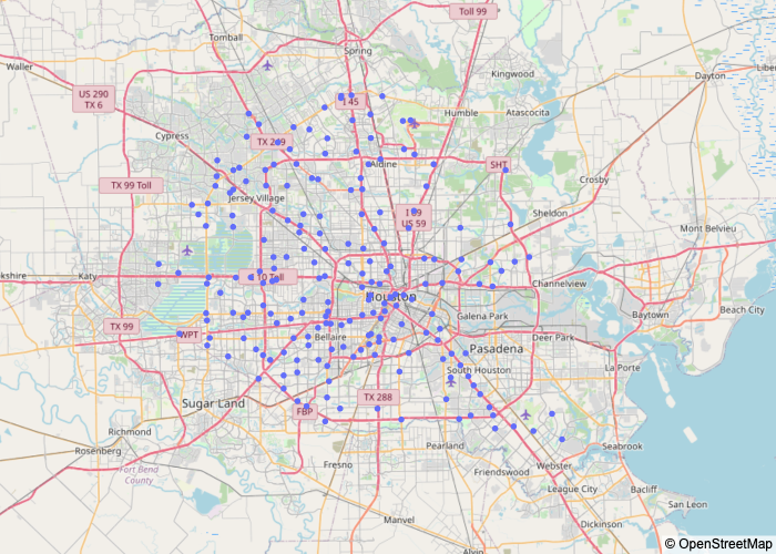
Figure 1 – Houston map with Subway’s
More Data Sources for later Integration
Once we had our SafeGraph Patterns data filtered and organised, we started to investigate other external data sources to find Houston Weather History Data and Houston Socioeconomic Data. The idea of integrating these data sources is to make a more complex model considering other features as a bad weather/good weather day, wealthy/poor census block etc. We also thought about integrating Calendar Data to put binary variables indicating if it is a National Holiday and another variable indicating if it is weekend. We believe that the amount of visits to a fast food store could be really influenced by these kinds of features.
After a long time searching and no results, we asked in Slack Forum about Texas Socioeconomic datasets. Thanks to Slack members we realised that SafeGraph has its proper socioeconomic dataset called «Open Census Data». So, in order to have all the features previously described in our model, we had to integrate our main dataset called «Patterns» with «Open Census Data» which has this socioeconomic information as for example, income per census. To add even more information we also consider integrating it with another SafeGraph dataset called «Core Places (core poi.csv)» .
Once the income data had been obtained and integrated with the other variables that we already had, we would like to know how the income varies for each of the censuses of the city of Houston.
The following graph has been obtained thanks to the following website: http://proximityone.com/harriscounty_tx.htm
It can be seen how the areas with the most resources (greater than 60,000) are located on the outskirts of the city.
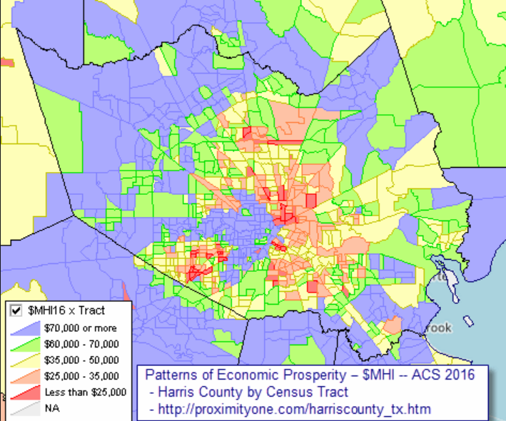
Figure 2 – Houston Income Map
Then, once it has been possible to visualize the areas of the city according to their income, in the section called «First approach to real visits«, the visits of some Subway stores will be displayed to observe how their evolution behaves and thus, consider the occurrence of outliers.
Data Transformations and Integration
Next we are going to explain all the issues we had in this Milestone with missing values, outliers and other transformations in each dataset.
One of the first issues we had after filtering our Patterns data, was realising that there was another town called Houston. Actually there are 20 towns in the USA called Houston. So we had to redo our filtering by adding the region ( city=Houston and region=Houston).
Our approach consists in doing all these data treatments in each filtered dataset (Patterns, CorePlaces, Weather, OpenCensus, Holiday) separately before integrating everything, in order to obtain cleaner results after integrating.
In the «Patterns» Dataset we decided to remove all missing values from the most important feature: visits_by_day. As the patterns dataset is built, each value of Visits_by_day is a list of 30 values representing visits by day to a specific Subway store in a specific month, in a specific year. So really, the 176 outliers we have there actually represent monthly data from a specific store.
The next transformation is to undo these lists to have visits by each day. Rows which visits values where 0 were removed, that is because it does not make sense to keep values that are either wrong (it is not possible that an open store as Subway does not have at least one visitor) or are closed. We decided to remove this data because we thought that when a company uses our model, they will not expect the model to predict when a store is closed and furthermore it would make the prediction task even more difficult.
We modified Patterns Dataset to have as many rows as different dates (from 20…) and visits_by_day for each date mentioned before for each Subway store in Houston. This transformation is needed because the expected input for a model is daily data. Also we had to treat some duplicates in this variable.
Another thing to take into account, related to “Patterns” Dataset, is the fact that some lists and dictionaries were not really that type, otherwise they were strings. To transform this like real lists and dictionaries we needed to use the library json, more precisely the “load” method.
In the Houston Weather Historical Data, obtained from wundergroud.com, we have daily historical weather data indicating the amount of rainfall in Houston. The process was simple. The idea was to get the data from this website using Selenium. We got the data from just one month and then, we iterated the script in order to obtain the amount of rainfall in the period of time we wanted. Then, some values needed to be transformed just because Python did not recognise them as numbers. So, we needed to replace some characters with others, such as replacing the ‘,’ to a ‘.’ (the float standard version). Also, the values of the rainfall were given in inches, so we needed to transform those values to a more common scale, as mmHg (used to represent how much has rained in a place). The process to change this scale was just multiplying the previous value per 25.4, because 1 In = 25.4 mm.
Finally to be able to add Open Census Data, first we had to determine in which csv file of all of the Open Census Data directory system was located the “Median Household Income” (B19013e1) feature. After iterating each csv we discovered that the one we needed was cbg_b19.csv. Once we had this information we created the cbg_income variable in our dataset and we filled it using this condition while iterating the cbg_b19.csv file. The condition checks row by row if the cbg code from csv is the same as Houston Subway store cbg and if so, we add the income information for that census block.
subway[‘cbg_income’] = np.where(subway[‘poi_cbg’] == str(row[1][0]), row[1][1], subway[‘cbg_income’])
Data Normalization (CBG micro normalization)
This step has turned out to be one of the most complicated during this Milestone II elaboration. The difficult part of building a model is that true count data is hard to come by. We realised that the raw visit counts from SafeGraph Data have to be normalised in order to obtain more reliable results. After a long research, the most accurate approach we could do in the available amount of time is adjusting visit counts based on the number of SafeGraph devices and the USA Census population in the visitor home CBGs.
Basically what we did was adding the Census_Population variable (B01001E1) from Open Census Data (in specific cbg_b01.csv) to our dataset from the Open Census Data. We also needed the CBG_Number_Of_Devices variable from home_panel_summary.csv. The formula we used for this normalization is dividing row by row CBG Population by number of SafeGraph devices in that CBG * raw_visit_counts.
First glance to real visits
Once the visits variable has been normalised, as we have been advised by some data scientists who have worked with this data, we would now proceed to the visualization of the real visits.
It has been decided to do this task in order to detect, if there are, stores that may contain outliers (for example, stores that do not have any visits in a day) in order to obtain a better model, with more realistic results, in the future.
Here are some examples of visits in some Houston Subways:
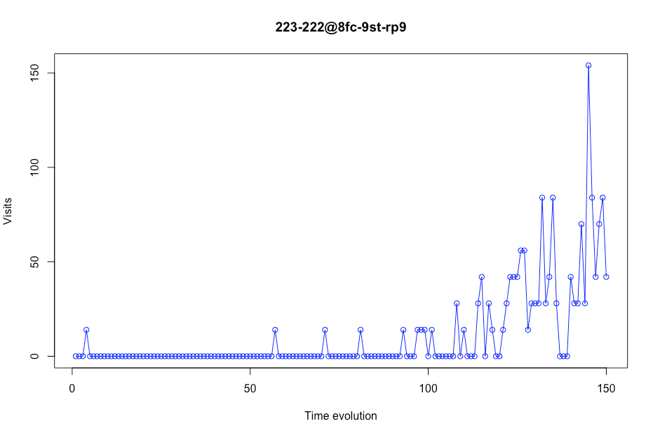
Before analysing each screenshot/plot, we need to explain the X axis. Here we have the time evolution. This time evolution is the number of days per store. We can not offer a vision of a timeline with a specific day because some days will be deleted (more about this later).
In this first screenshot, we can see that this particular store (store with placekey 222-222 @ 8fc-9qf-st9) could be considered acceptable to be used as training data due to the fact that it contains realistic visit values.
You can also see how visits drop considerably at the beginning of the graph. This is because at that time (mid-March), the quarantine began due to COVID-19. Due to this, it has been decided to eliminate the time range between December and March, so that it does not affect the prediction of real visits.
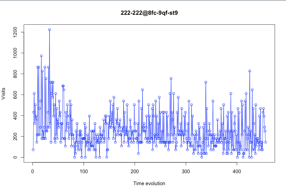
Figure 3 – Visits evolution in a certain store
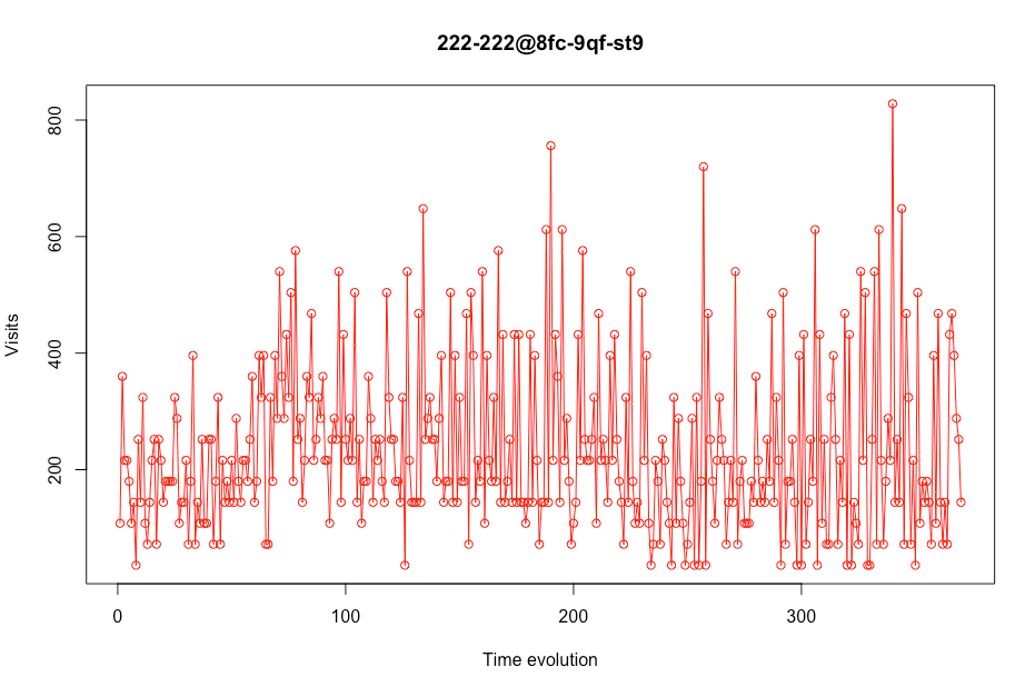 Thus, notice how the evolution of visits to the store mentioned above looks like, once the pre-COVID range time has been eliminated.
Figure 4- Visits evolution in a certain store without data precovid
 We not only have to look at stores with realistic visits, but also with those that have 0 visits in some time ranges because these stores could cause false predictions in the final model that is made.
Figure 5 Visits evolution in a certain store
As we can see in the next plot, some stores had few values. In this case, this store appears only 31 times in the data. We consider that a store should have a minimum number of days in the dataset. That number is 200 days. This means that if there are less than 200 values in a certain store, this place will be deleted from the data. For example, this store will not be in our model training subset.
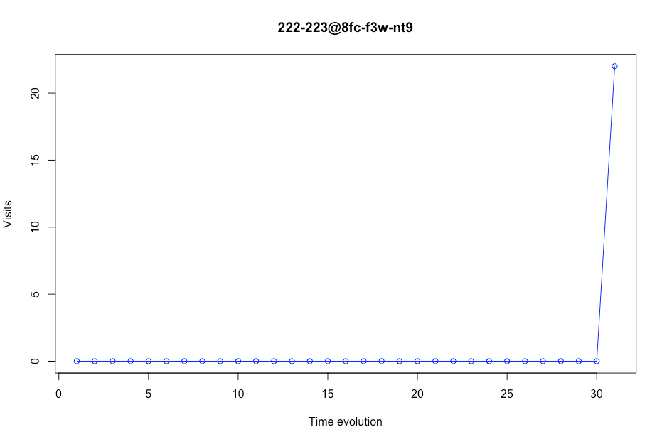
Figure 6 Visits evolution in a certain store
Some visits were outliers, so we decided to change these outliers to a normal amount of visits per each store. The function.clip() changes the outliers per other values. As we didn’t want to lose the higher or lower characteristic of the visits, we didn’t change the outliers values per the mean of the visits, we changed it to the upper or lower quantile, with a 90% of confidence. This is done with the following code:
upper = df_per_store.visits.quantile(.95)
lower = df_per_store.visits.quantile(.05)
df_per_store[‘visits’] = df_per_store[‘visits’].clip(upper=upper, lower=lower)
Also, we noticed that our visits evolution had huge imperfections. We considered it is almost impossible that a certain store could have, for example, 200 visits on a regular Monday and then its visits drop to 20 the next day. This is an error that we have due to how SafeGraph counts the visits (they calculate the visits with the number of devices and the population of a certain census block group). Using this formula, the visits evolution jumped from a high value to a very lower one. We had to smooth these visits in order to upgrade the model comprehension of this trend. This technique is called convolution.
The formula we used to modulate this visits per each store was:
So, applying this convolution to our data, we passed from a visits evolution like this:
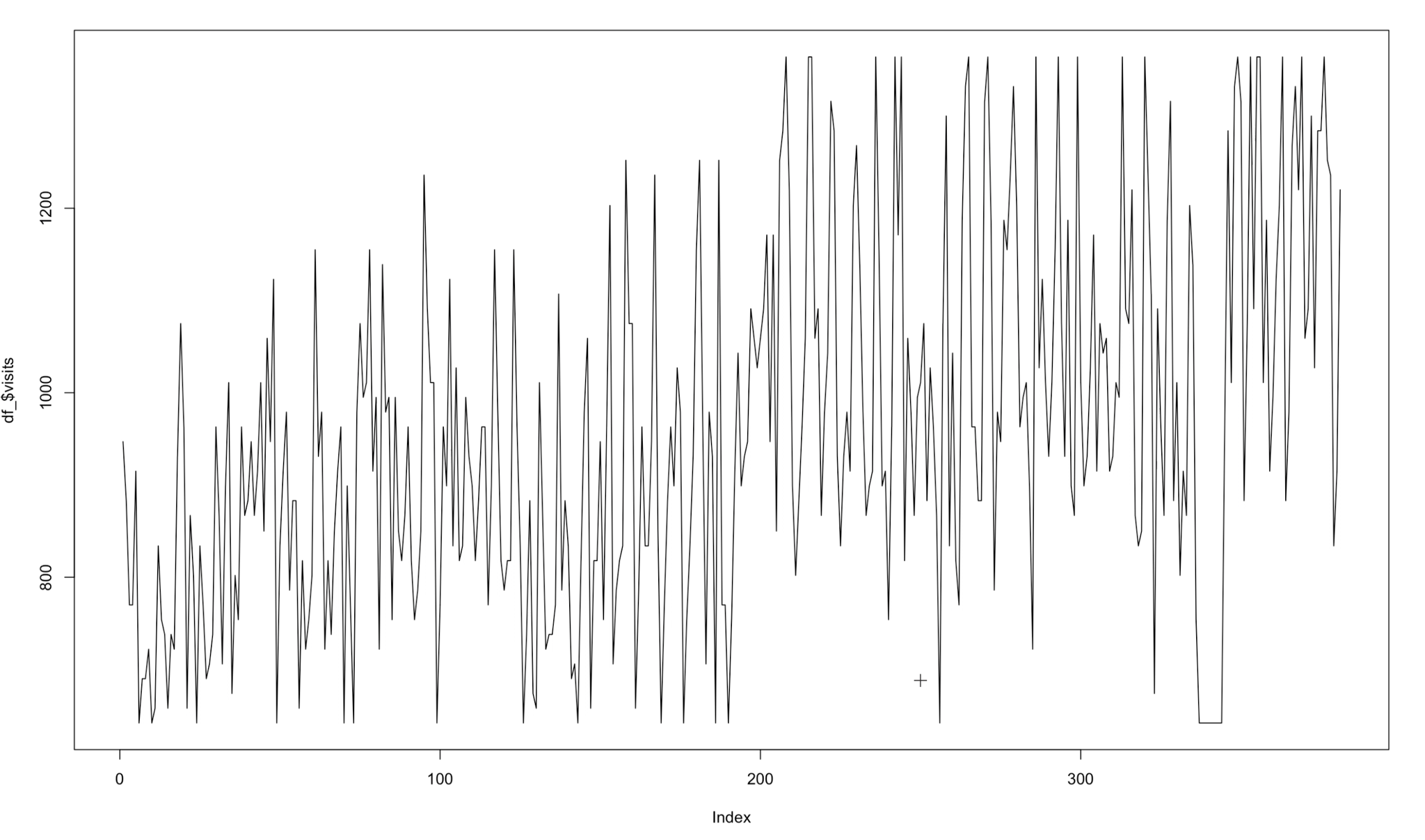
Figure 7 Visits evolution in a certain store
To this:
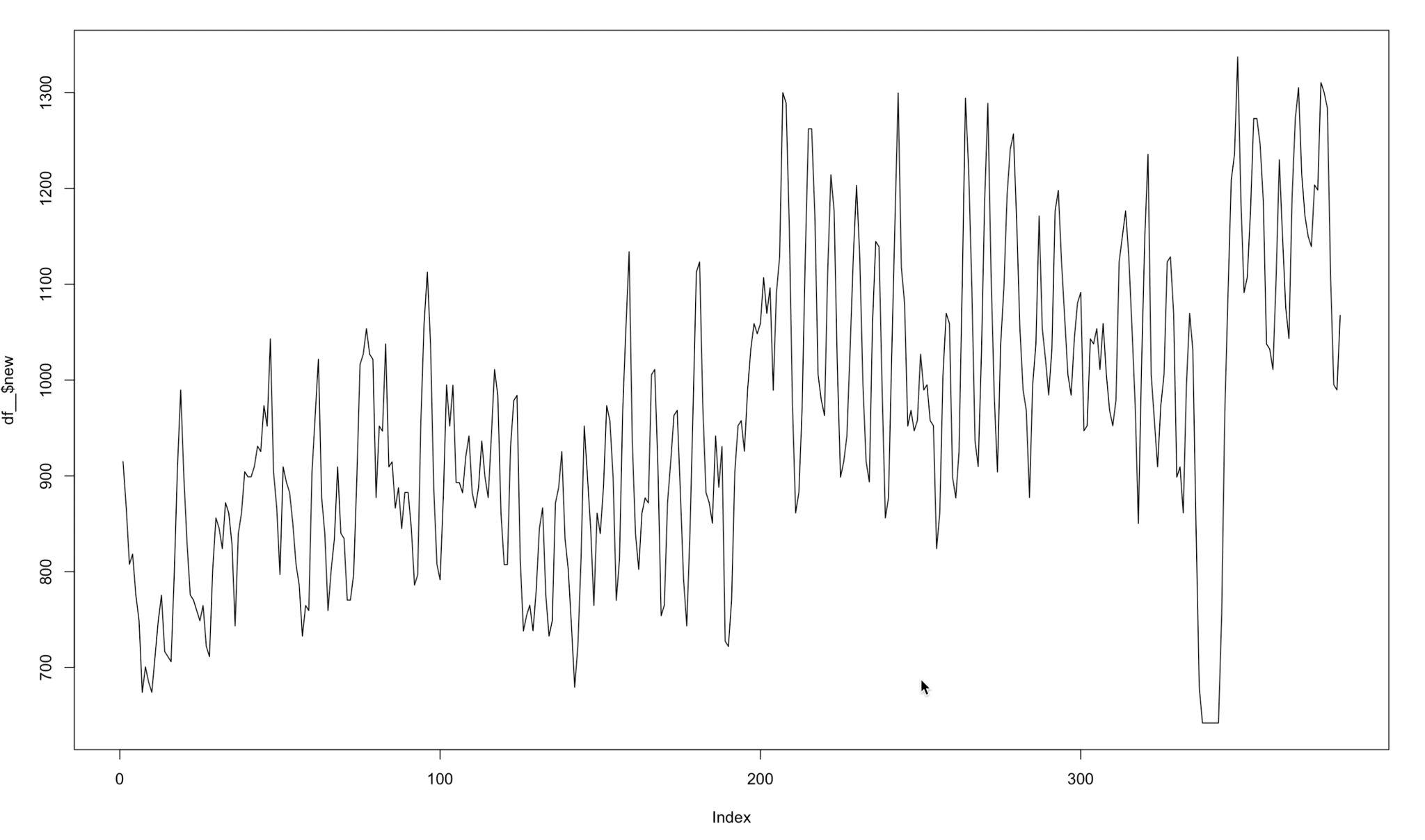
Figure 8 Modelated visits evolution in a certain store
With this calculus, every model improved nearly 10% of its score. Of course, using this transformation in the test data would be cheating. That is why the value to predict in the test data was the visits without the calculus. So, to sum up, the train data is using the visits modulated and the test data is not.
Model / Evaluation Iteration
After a first iteration of the model (explained in Annexes), a simple linear regression model was chosen. Its metrics were the MSE=5456 and the R²=0.6874. Most of our features had almost no effect in the model. So we faced the second iteration with the hope of looking for mostly new relevant time related features that could improve this model metrics.
For the second iteration of the model, before adding any extra variable, we decided to introduce new stores apart from Subway in order to evaluate our final model in different cases. The added franchises were: Starbucks, Walmart and Old-Navy. Not only we wanted to focus on the food field but also on other sectors such as clothing, shopping centers, among others.
Once these stores were added, we also decided to append some more variables in relation to time. The ones we added to evaluate our model in the first iteration were the following: last_week_visits and yesterday_visits apart from the months and days of the week.
Then, for this second iteration we applied more time ranges like: mean_last_3_days, mean_last_7_days, mean_last_14_days, mean_last_21_days, mean_last_30_days, mean_last_60_days. Apart from all these temporary variables, some other ones were introduced for this second try. For example, dividing the city of Houston into four areas (south-west, north-west, south-east, north-east) population, income per cbg, parking near the stores.
In addition, we wanted to implement more models aside from a linear regression. For this reason, it was decided to use some popular techniques such as RandomForest but the regressor version of it (RandomForestRegressor), a regressor version of Support Vector Machines (SVR), GradientBoostingRegressor, XGBoost, and Stacking, which consists of a combination of different classifiers. The best model that we got so far in terms of MSE and R2 was Stacking which consisted of four base models (XGBoost, LGBMRegressor, Random Forest and Lasso Regression) with xgboost as our meta regressor.
In order to further increase our model’s prediction capability we should use GridSearchCV from sklearn to fine-tune each of the stacking models, however as this is not for a real client we did not implement it due to the lack of computing capacity (only the stacking took almost an hour for one company).
Besides, it is fair to say that the most important improvement we made for this second iteration was the fact of applying the convolution technique, as it is clearly explained in the Data Preparation – First Glance to real visits section.
After appraising all these considerations that have been commented previously, it was possible to obtain that the best model was with the following variables: day, rain, yesterday_visits , last_week_visits, mean_last_7_days, mean_last_30_days.
Next, the results that have been obtained in each of the stores are shown once the improvements, that have been discussed, have been made:
Subway
| Model | Score (R²) | MSE |
| Lasso Regression | 0.8194 | 2606.07 |
| RandomForestRegressor (100 estimators) | 0.8165 | 2647.44 |
| SVM (SVR, C=1, kernel=’poly’, degree=2) | 0.6548 | 4981.47 |
| GradientBoostingRegressor | 0.8184 | 2680.45 |
| XGBoost | 0.8016 | 2928.15 |
| Stacking | 0.8190 | 2556.64 |
Table 1 Subway Model
Starbucks
| Model | Score (R²) | MSE |
| Lasso Regression | 0.9127 | 7137.03 |
| RandomForestRegressor (100 estimators) | ** | ** |
| SVM (SVR, C=1, kernel=’poly’, degree=2) | ** | ** |
| GradientBoostingRegressor | 0.9163 | 6585.86 |
| XGBoost | 0.9063 | 7377.66 |
| Stacking | 0.9200 | 6371.41 |
Table 2- Starbucks Model
**We didn’t try to train these methods due to the fact that the results were much worse than the others that are presented.
Walmart
| Model | Score (R²) | MSE |
| Lasso Regression | 0.9209 | 163281.98 |
| RandomForestRegressor (100 estimators) | ** | ** |
| SVM (SVR, C=1, kernel=’poly’, degree=2) | ** | ** |
| GradientBoostingRegressor | 0.9163 | 133153.86 |
| XGBoost | 0.9063 | 168204.66 |
| Stacking* | 0.9348 | 126180.24 |
Table 3 Walmart Model
Old Navy
| Model | Score (R²) | MSE |
| Lasso Regression | 0.7876 | 3228.11 |
| RandomForestRegressor (100 estimators) | ** | ** |
| SVM (SVR, C=1, kernel=’poly’, degree=2) | ** | ** |
| GradientBoostingRegressor | 0.7410 | 4243.22 |
| XGBoost | 0.6754 | 5319.66 |
| Stacking | 0.7339 | 4360.41 |
Table 4 Old Navy Model
Visualization
Introduction
From a future startup vision, we needed an easy visualization software in order to show our future clients what we are capable of doing. With this in mind, the idea of a dashboard came out. With a fully functional dashboard our potential clients would get the idea of how our startup could help their companies in presentations or elevator pitches.
Using visualizations is a great idea to quickly communicate the technical information given by machine learning models to our future clients even though they might not know about machine learning or data science in general. This approach allows us to be creative, concise and effective. With the catchphrase of “Less is more” in our mind, we needed to think about which information should be in the dashboard and which not.
As our core appeal as a startup was predicting visits for companies, we decided to include several KPIs created from the visits prediction such as estimated benefits and estimated workforce, that would further help them. Of course, each of our KPIs would be customized for each of our clients needs so the way of estimating them. (It is not the same predicting the workforce of a Walmart from their visits that predicting the workforce of Starbucks)
Taking everything into account, we decided that it was really important not only to create this valuable information for our clients but to be able to effectively show them that information in a way that they can put it into practice. That is the only way in which our potential clients can figure out if they would like to hire our services.
On balance, after explaining all our process of doing the Dashboard, we are attaching some images to illustrate our work:
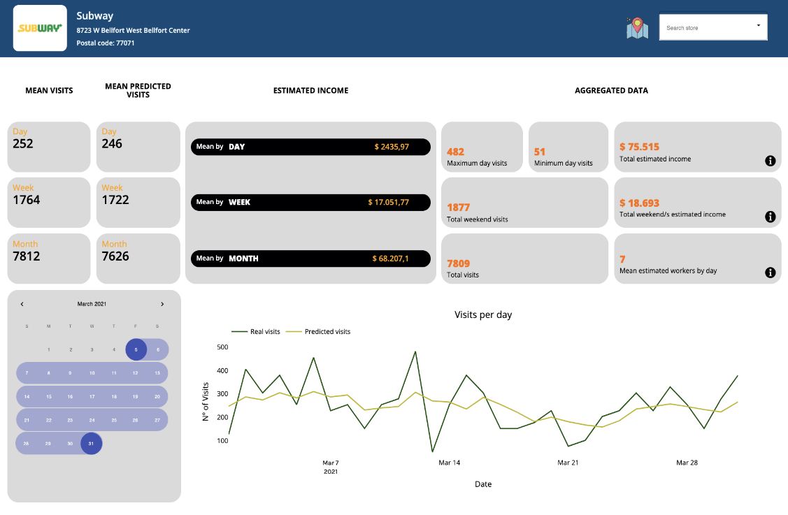
Figure 9 Dashboard example
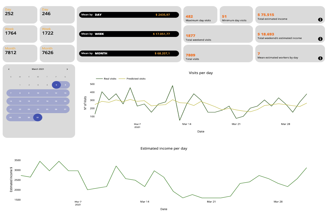
Figure 10 Dashboard example
Technical aspect
The design of a dashboard was not an easy thing to come up with. We decided to show our model daily predictions vs real daily predictions in a plot line so that it is really simple to compare our model performance with the real visit counts. Nevertheless, this was not enough for the dashboard so we did some research about simple KPIs in these kind of franchises, some of them explained below:
- We were interested in discovering how much money a client would spend in a Subway store in the United States, after some research we decided to count that normally this price is around 10 bucks. Not to mention that in fast food stores a client visits is equivalent to a purchase.
- The next question was about how many employees per client are needed in a Subway store. According to most articles on the subject, 4 employees are needed to serve an average of 150 customers.
- For the Starbucks franchise, we discovered that the average purchase is about 4,10 dollars and we also suppose that each client visit there is equivalent to a purchase.
- In the Starbucks store, the ratio employee/customer is 4 employees for 210 customers more or less.
- In Walmart stores the average price we have considered is 55 dollars, and there are practically no people that go to Walmart without a purchasing goal. The ratio employee/customer is 200 employees for 2000 customers
- In Old Navy stores the situation is quite different, as we all have experienced personally when buying clothes, it is quite normal to visit a clothing store without buying anything, so for that statistics we have considered that only a half of visitors become buyers. The average purchase is 100 dollars in this case. Five employees are needed for every 250 clients.
Putting together and summarizing all this information, we added some aggregates to each of our clients’ Dashboard as an Estimated Income by Day, by Week and by Month among other personalised aggregates.
The calendar feature is provided for clients so that they can select a window of time in which they want to know the value of the aggregates such as: minimum and maximum income in that time, total profits, minimum and maximum visits, average weekend statistics, etc.
We also added an Estimated Number of Workers by Day so that our client could foresee the needed workforce.
Conclusion
To conclude this three-month project, we are going to go through the phases that we have faced as a group and how we have tackled the problems that we have faced throughout the project’s trajectory.
The first bump of all was the task of understanding, processing and filtering the data provided by SafeGraph, followed by the complicated task of establishing a realistic goal limited by the time and knowledge available to us.
The challenge of extracting information from the data to create a new, useful, and engaging business model has been a process that has had to go through many iterations.
Once the goal of predicting visits for certain US stores had been decided, the project took another pace. We knew how to transform the data to have it in our favor in order to complete our goal.
In the model construction phase, the next complication came with the small size of the time window that SafeGraph provided us: only data from 2020 and 2021. This limited us in terms of using possible deep learning models with a good reputation for that type of modeling. (SEE LSTM). The chosen approach was to train a regression model eliminating the temporal dependencies and smoothing the biases that came from the raw data from Safe Graph. Not to mention many of the tries carried out in order to integrate variables of interest outside of SafeGraph that would improve the predictions, of which the only successful one was adding meteorological variables.
The final model chosen after several fine-tuning iterations has been Stacking, described in the Model / Evaluation Iteration section.
The next decision was to choose the best medium and way to present the results of the model with a business focus.
We decided that in the hypothetical case that the project was successful, we would be a Data Science Consulting startup that had a digital platform where each of our clients had a private area with a personalized Dashboard where the predictions / results of the analyzes performed.
And here our project ends. Starting from very complicated data, a business model has been obtained with a very probable future in the world of work. It is a reason to be proud.
Legacy
As we have mentioned, all of this work is not going to be in vain because we all think that it has a future of becoming a successful startup. Thanks to all the progress made during the year we have been able to create a project that shows what we are capable of doing and how we could help our potential clients.
Regarding the data, it is not ours since it comes from SafeGraph so it will not be of public access. Also, for obvious reasons we will keep critical parts of the code to ourselves, keeping it in private mode on our Github Repository. We might develop documentation so that in the case that someone of us tries to use the code in the future, he/she can easily catch up with what we did in the past.
References
| Van Der Walt, Stefan, S. Chris Colbert, and Gael Varoquaux. «The NumPy array: a structure for efficient numerical computation.» Computing in science & engineering 13.2 (2011): 22-30.
Liutu, Riina. «Subway Market Research.» (2010). |
Pedregosa, Fabian, et al. «Scikit-learn: Machine learning in Python.» the Journal of machine Learning research 12 (2011): 2825-2830.
Gackenheimer, Cory. «What is react?.» Introduction to React. Apress, Berkeley, CA, 2015. 1-20.
| Tosi, Sandro. Matplotlib for Python developers. Packt Publishing Ltd, 2009.
Marr, Bernard. Key Performance Indicators (KPI): The 75 measures every manager needs to know. Pearson UK, 2012. Zheng, Siqi, et al. «Transit development, consumer amenities and home values: Evidence from Beijing’s subway neighborhoods.» Journal of Housing Economics 33 (2016): 22-33. Haney, Matthew Robert. The impact of Walmart on community outlook: A study of two communities in Texas. Diss. 2009. Verbert, Katrien, et al. «Learning analytics dashboard applications.» American Behavioral Scientist 57.10 (2013): 1500-1509. Efron, Bradley. «Missing data, imputation, and the bootstrap.» Journal of the American Statistical Association 89.426 (1994): 463-475. Brown, Robert Goodell. Smoothing, forecasting and prediction of discrete time series. Courier Corporation, 2004. |
Ting, Kai Ming, and Ian H. Witten. «Stacking bagged and dagged models.» (1997).
Chen, Tianqi, et al. «Xgboost: extreme gradient boosting.» R package version 0.4-2 1.4 (2015).
| Elsworth, Steven, and Stefan Güttel. «Time series forecasting using LSTM networks: A symbolic approach.» arXiv preprint arXiv:2003.05672 (2020).
Muzaffar, Shahzad, and Afshin Afshari. «Short-term load forecasts using LSTM networks.» Energy Procedia 158 (2019): 2922-2927. |
Annexes
First model iteration
First of all, we would like to take into account that the nature of our data is a time series. We have transformed it by converting time-dependent variables to new modified features. After all these transformations we obtained panel data. However, trying to do cross-validation as well as bootstrapping we got poor results. This makes sense because our data is intrinsically ordered thus can not be randomly sampled.
We took the first 70% of our dataset as a training subset and the last 30% as a test subset. The first hyperparameter tuning we did was with the Ridge model with alpha=1.
The metrics that we used to evaluate the model are the MSE, mean-square error, which will be used to assess the quality of our predictor. Since we are assuming that the cost of overestimating and underestimating visitors is the same, the MSE fits our purposes.
The R², R-squared (R2) is a statistical measure that represents the proportion of the variance for a dependent variable that is explained by an independent variable or variables in a regression model. Whereas correlation explains the strength of the relationship between an independent and dependent variable, R-squared explains to what extent the variance of one variable explains the variance of the second variable. So, if the R2 of a model is 0.50, then approximately half of the observed variation can be explained by the model’s inputs.
Our first model deployment was not as good as we expected. Our Ridge model had a MSE=11000 and a R²=0.27. These metrics were very improvable.
Then, we noticed a big error in the training subset. The data was sorted by store, not by the date. The model needed to capture how each row was developing over time. After sorting the data by date, we trained the model again and tested it. Now, the metrics are better: MSE=6500 and R²=0.63.
Afterwards, we tried different models such as Lasso and Elastic Net, with different alphas. ( We iterated different alpha’s values and chose the most optimal one in order to create a balance between error rates due to variance and due to bias). Generally speaking alpha increases the effect of regularization.
Lasso with alpha=1 was the best one so far.
After Ridge, Lasso and ElasticNet, a simple linear model was trained as well in order to try to see if it could improve the Lasso model metrics. We trained it in R, just because the output that this software gives is very helpful to understand the model. The metrics were the MSE=5456 and the R²=0.6874.
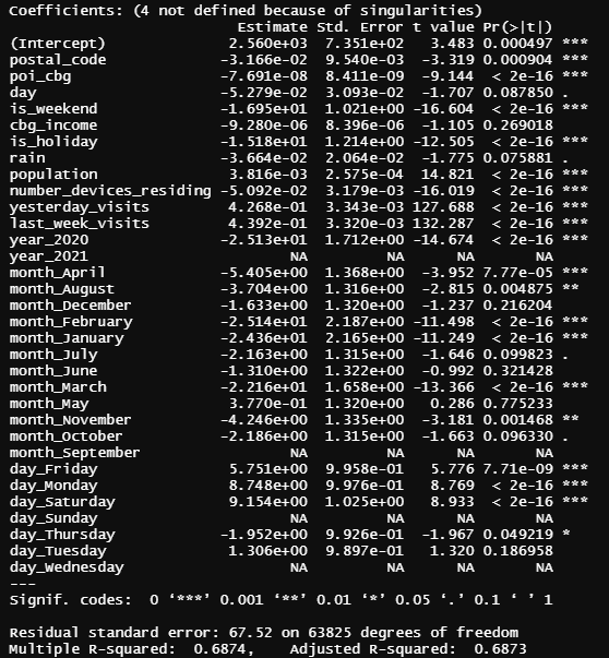
Figure annexe 1 – Subway Regression Output
For this first model building stage, after some iterations explained before, we finally decided to choose simple linear regression.
Interpretation of coefficients:
First of all, the NA values we can see in the table above are due to the fact that the model has automatically detected high correlation in these variables and eliminated them from the list of regressor variables.
The stars we can see in the right column indicate the significance of each variable, the more stars, the more significant the coefficient is.
Monday and Saturday have positively significant coefficients, which says that on Monday and Saturday there are more visits, while on the other days of the week (for example, Thursday) there are less.
At this point we can not explain the number_of_devices_residing coefficient, because according to the model, the more devices are located in the cbg, the less visits are there. For the next iteration we will delete this variable from the model.
We can see that the coefficient of the year 2020 is negative, and as this variable is a dummy variable, we infer that the visits in year 2021 have increased compared to the visits in 2020 (which makes sense with all the COVID situation).
With respect to the month’s coefficient we can not find any socio-economic explanation. We do not know how to interpret them because it does not make sense that all coefficients are negative, so in the next milestone we will probably drop these variables.
Last but not least, all the variables that we implemented related to past visits (last week visits and last day visits) are quite significant to the model (as we expected) and makes us think that if we add more variables related to past visits (for example the average of last month’s visits) we could improve our model.
Methodology
Our methodology is going to be “Keep It Simple” (KIS), we are going to have three lists of tasks, one list consists of TO-DO tasks; it has tasks that we have to do but they haven’t been started. Another list will consist of tasks we have already started and are in progress (not finished). The last list will regard done tasks, in this list we are going to store all the finished tasks.
Each task of the KIS methodology will have its participants and a deadline. Each task must be finished before the deadline.
In order to monitor our progress throughout the project, we’ll make use of Trello. It will be useful for managing and organizing all the tasks and also to see who is/are in charge of which one. Furthermore, this tool will enable us to follow KIS methodology. All the lists of tasks are visible in the following Trello board: (https://trello.com/b/rqu6A2U8/project2021)
As regards meeting dynamics, we will use Teams or Discord (depending on the quality of the service on the day of the meeting). We are going to schedule meetings each weekend at an hour that fits all the team (preferably on Sunday).
When it comes to code elaboration we will use Visual Studio Code Live Share which enables live sharing of code, so everybody in the project is going to be able to work in the same file of code at the same time. Furthermore, we will use Github for code versioning, as well as a central repository where the most updated version of the code will be stored.
(https://github.com/angel-langdon/Project2021)
Pipenv
Pipenv is a convenient library for managing virtual environments. Furthermore, we have developed a script that automates the installation of the necessary packages as well as adding global utilities functions to the Python PATH. By doing this, once we are in the virtual environment we can import global functions that are used in multiple parts of the project with ease. For example, from any folder of the project we could do the following:
from utils.download.download_safe_graph_data import download_census_data
The script was made for automating the installation of the packages and the process of adding the global functions to the path can be found here (the script was uploaded two months ago and can be checked in Github last commit date) :
Github Repository
Link to github: https://github.com/angel-langdon/Project2021
Entre Datos Webpage
Link to Entre Datos: https://entredatos.es/project2021-costomize